

Welcome to the second and final part of our article series on building a real-time report using Google Analytics (GA4), BigQuery, and Looker Studio.
Hello, and welcome to the final part of our detailed guide. In this segment, we will discuss how to use Google BigQuery and Looker Studio to report real-time data in Google Analytics 4 (GA4).
If you haven’t read the first part yet, I highly recommend doing so to understand the groundwork we’ve laid thus far. It will also help you follow along with this continuation.
In the previous instalment, we delved into the concept of a real-time dashboard, explored its possibilities and limitations within GA4, and discovered how to overcome these limitations using Google BigQuery, SQL, and Looker Studio.
Also, in the previous part of this blog post, we shared the SQL query we used, along with insights into dashboard planning, a step-by-step guide on connecting the data to Looker Studio for dashboard building and some essential configuration to the data source.
In this concluding part, we’ll focus on building the dashboard in Looker Studio. Then, we’ll walk you through various data manipulation techniques and strategies to consider when making yours. This article’s content delivery methods will be text, images, and videos.
Get ready to dive into the exciting process of creating an engaging and informative real-time dashboard using Looker Studio. Let’s get started!
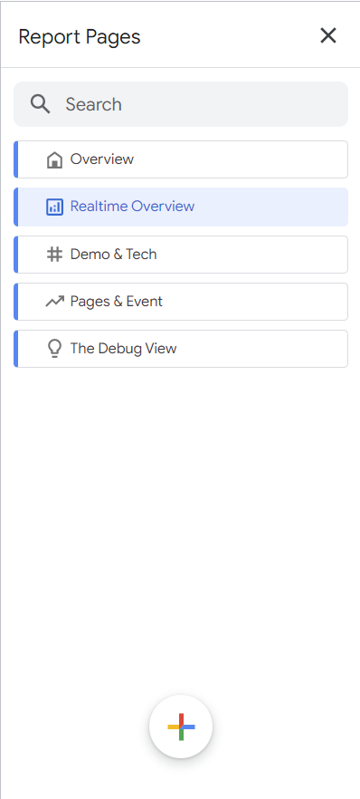
The Report Page Structure In Looker Studio
Within the Looker Studio dashboard, we have carefully structured our Google Analytics (GA4) real-time data presentation across five distinct pages:

- Overview
- Realtime Overview
- Demo & Tech
- Pages & Events
- Debug View
Let’s take a closer look at what each of these pages aims to accomplish.
Overview:
This section aims to provide marketers, stakeholders, and other dashboard users with a comprehensive understanding of the dashboard’s purpose.
We will explain what data is available in the dashboard, demonstrate how to navigate and utilize its features effectively and provide background information on the displayed data. Additionally, we will include details about the data source used in the dashboard.
Realtime Overview:
This section will delve into the real-time overview data collected by GA4. The data will be presented in an aggregated format, focusing on key metrics such as sessions, users, event count, user type, data stream type, hostname, and more.
Demo & Tech:
This section of the report will present geographic and device technology data about the website visitors, including their location information and the technology they are using.
Pages & Event:
Another section of the report will provide more detailed insights into user activities, including specific events performed, website conversions, and the pages users actively engage with in real-time.
Debug View:
In this dashboard section, we aim to replicate a debug view similar to what we are familiar with in Google Analytics (GA4).
We will blend the “GA4 Realtime Event Parameters Table” with the “GA4 – Realtime Data Table” we covered in this article’s first part.
How To Create Pages In Looker Studio:
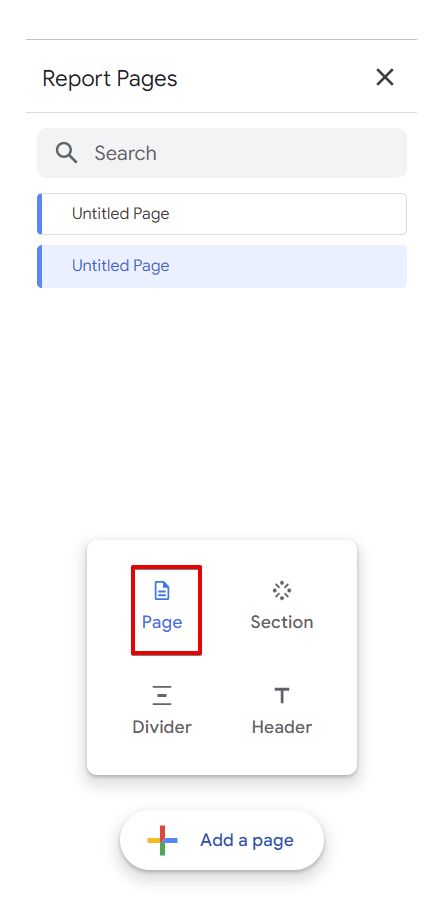
You can create new pages by clicking the “Add Page” option on the menu (That’s if you have just one page in your report)

It should open the report pages panel, where you can add new pages by clicking the plus icon and selecting the page as your option.
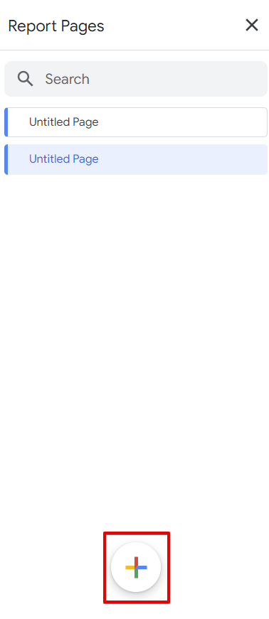
Choose pages as your option.
Your page structure might look similar to the one in the image below.
Having discussed the structure of the report pages, let’s now delve into the modifications and calculations we’ll need to apply to the Big Query data source before integrating it into our charts used in the Google Analytics 4 (GA4) real-time Looker Studio report.
*Recognizing that your business’s reporting needs may require a unique page structure is crucial. Therefore, it’s essential to tailor it accordingly.
Modifications + Calculations To Be Applied
The next step in our dashboard construction involves performing calculations on our BigQuery data source using “Calculated Fields.”
We will manipulate the data by creating “Calculated Fields” at the data source level rather than the chart level. It allows us to apply these calculations to our charts at any point in the report.
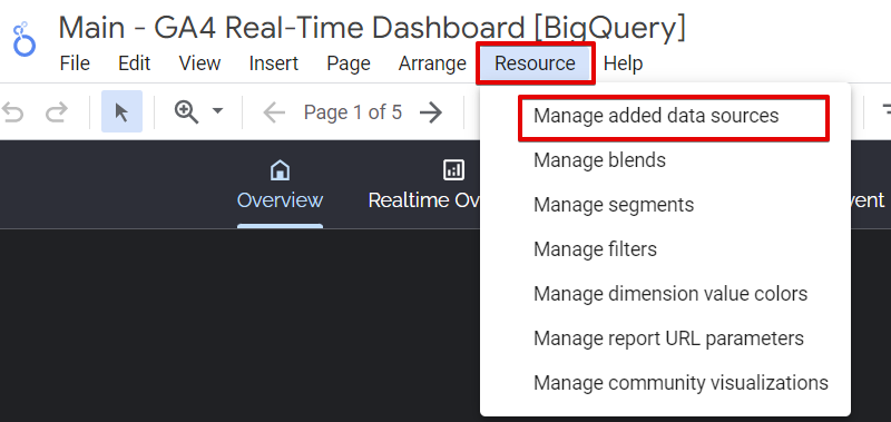
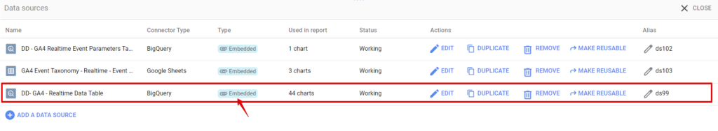
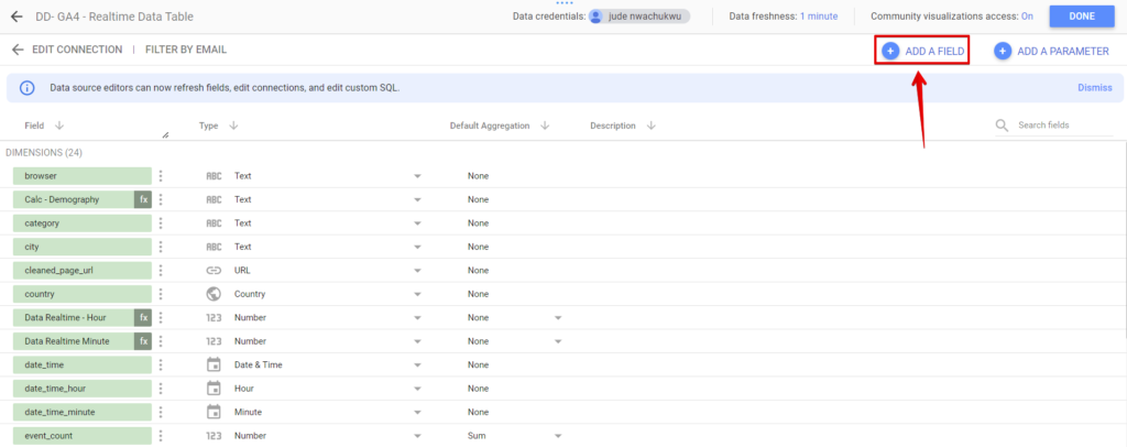
Navigate to our GA4 BigQuery data source by selecting the “Resource” menu option and “Manage data sources.” It should bring up our “GA4 – Realtime Data Table.” Next, click the pencil icon to access the data source settings configuration.
Click the edit pencil icon of the GA4 realtime Data Table.
Here is a list of the calculated fields and data type transformations we will be implementing:
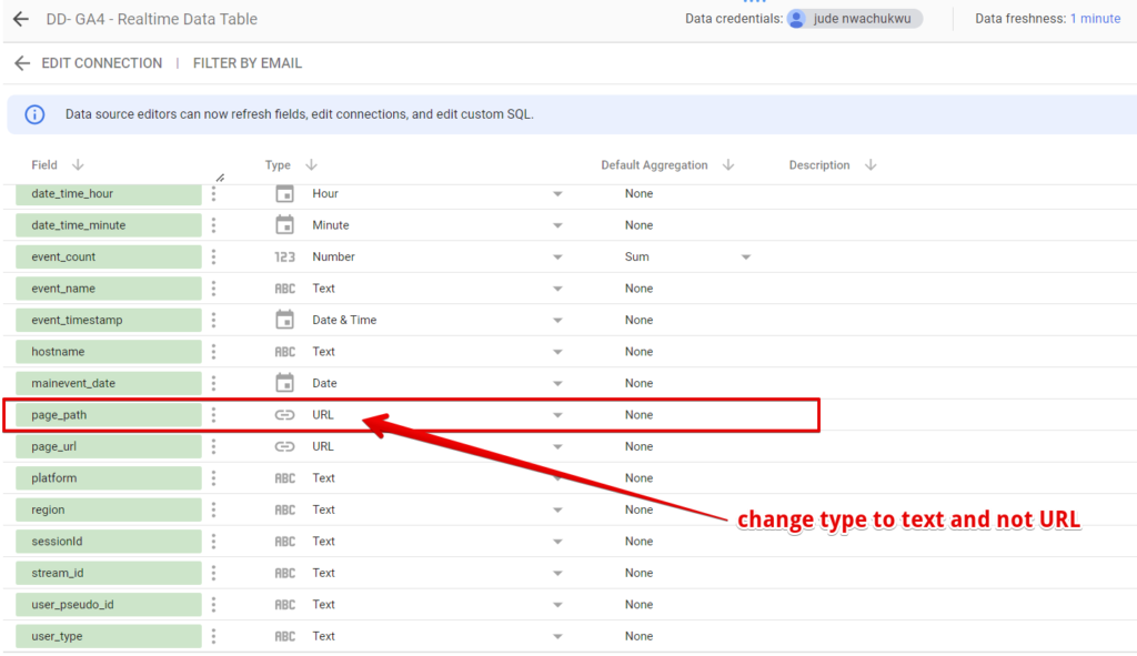
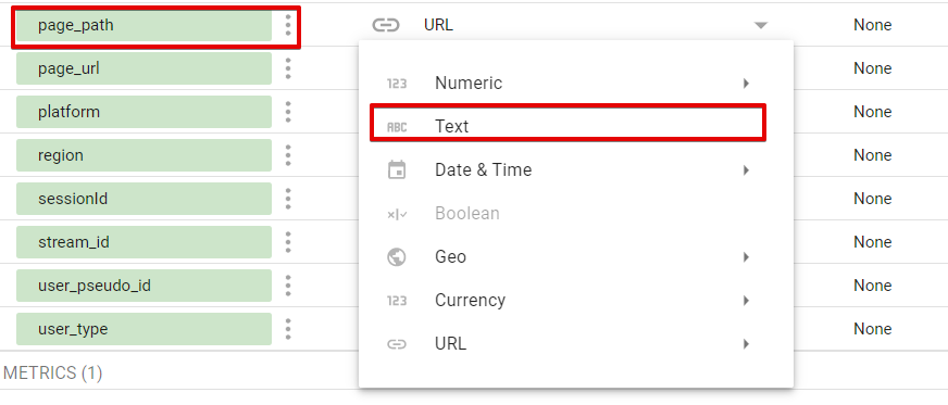
Change The “page_path” Dimension Data Type:
To modify the “page_path” dimension data type from “URL” to “text,” simply click on the dropdown menu in the data type cell. You can select “text” from there as the desired data type.
Make text the data type for the page_path dimension.
Assign a Label to Conversion Events:
Due to the absence of the “is_conversion_event” parameter in the GA4 BigQuery data export data schema, we need to create it in Looker Studio manually.
We will assign the label “yes” to conversion events and “no” to non-conversion events. Please update the function with your definition of a conversion event.
To add the “calculated field,” click on the “ADD A FIELD” button, enter the function provided below in the fields, give it a name, and click “save.”
The formula below should be added to the calculated field
CASE
WHEN REGEXP_MATCH(event_name, 'event_name1|event_name2|event_name3|event_name4') THEN "Yes"
ELSE "No"
END
Add the formula above with the correct conversion event name and click the save button.
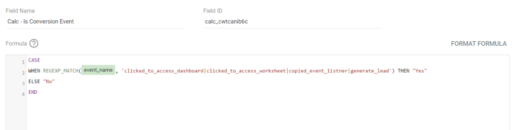
This newly created dimension field can be used as a filter in a chart to report conversion events.
Flag Conversion Events
To add some visual flair to our report, we will utilize the calculated field we created earlier to indicate whether an event is a conversion or not. This time, we will use a flag emoji “🚩” to represent conversions and a minus emoji “➖” to represent non-conversion events.
You have two options for creating this field. The first option is to replace the “yes” label with the flag emoji and the “no” label with the minus emoji, as it will provide a visual indication of conversion events.
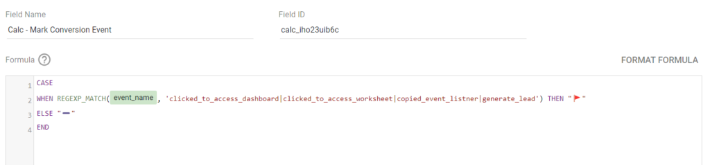
CASE
WHEN REGEXP_MATCH(event_name, 'event_name1|event_name2|event_name3|event_name4') THEN "🚩"
ELSE "➖"
END
Alternatively, you can use the conversion label fields we previously created in the formula above, and we will achieve the same result.
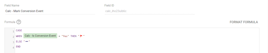
Here is the formula used:
CASE
WHEN Calc - Is Conversion Event = "Yes" THEN "🚩"
ELSE "➖"
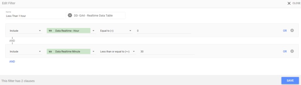
ENDRetrieving The Hour Difference:
The purpose of this calculated field is to calculate the time difference between the event timestamp and your reporting timezone, resulting in the hour difference. This calculation allows dashboard users to view data for specific timeframes, such as the last one, two, or three hours.
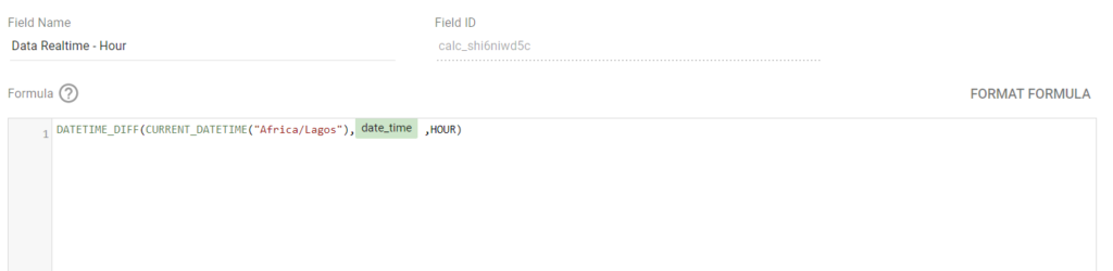
Below is the formula that should help us achieve this in Looker Studio.
DATETIME_DIFF(CURRENT_DATETIME("Africa/Lagos"),date_time ,HOUR)*Remember to substitute the timezone with your reporting timezone
Retrieving The Minutes Difference:
Similar to the calculation for the hour difference, we can now calculate the minute difference. By utilizing the formula provided below, in our “calculated field”.
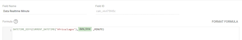
Here is the formula used in the calculated fields. Remember to use the correct time zone.
DATETIME_DIFF(CURRENT_DATETIME("Africa/Lagos"),date_time ,MINUTE)As we proceed with the dashboard build, there are two components we will address: a parameter and a calculated field that we will create at a later stage.
Building The Dashboard
Let’s delve into the dashboard build phase, exploring the various components shaping our Google Analytics (GA4) real-time Looker Studio report.
It’s important to note that your final dashboard may differ from mine, as you are encouraged to tailor it to your specific business reporting requirements and address the pertinent questions related to your real-time report.
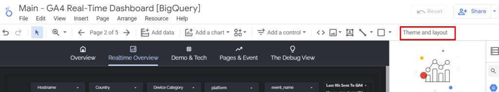
Let’s examine the configuration settings applied to our report theme and layout.
Configuring The Report Theme & Layout
Ensuring that the dashboard aligns with your client or business branding is essential, incorporating colours and fonts that reflect your organization’s preferences.
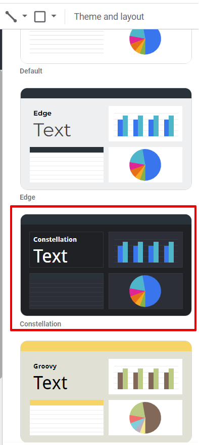
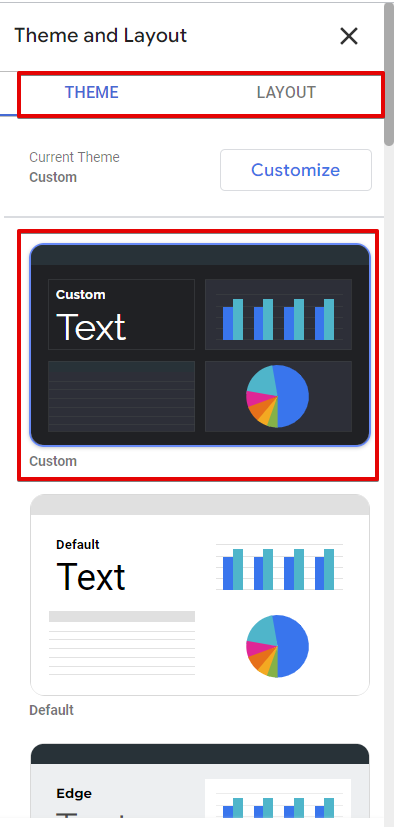
To access the customization options, navigate to the “Theme and Layout” menu. It opens a panel with two tabs: “Theme” and “Layout.”
In the “Theme” section, I opted for the “Constellation” theme but made specific modifications such as adjusting the font, styling the page navigation, and enhancing the data dimension presentation.
Moving on to the “Layout” section, I personalized the navigation menu display, selected a custom canvas size, and enabled the report to align with “smart guides”, ensuring an optimal visual experience.
Now that we have covered the theme and layout configurations, let’s add control filters to the report, enabling users to obtain the required insights quickly.
Adding Report Control Filters and Buttons
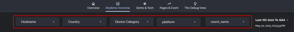
To enhance the functionality of our dashboard, we will incorporate six control filters and four native buttons. The following is a list of the control filters we will include:
- Hostname
- Country
- Platform
- Device category
- Event name
- Hour category (allows users to customize the timeframe for data analysis, this can be a simple timeframe, such as the last 4 or 5 hours, or a complex timeframe, such as the previous 6 and 9 hours, or any other desired duration)
Please note that you can add filters based on your specific dashboard requirements. For example, if your dashboard users need to filter or segment the data by page path, city, or region/state, you can include these filters.
Here is how to add control filters;
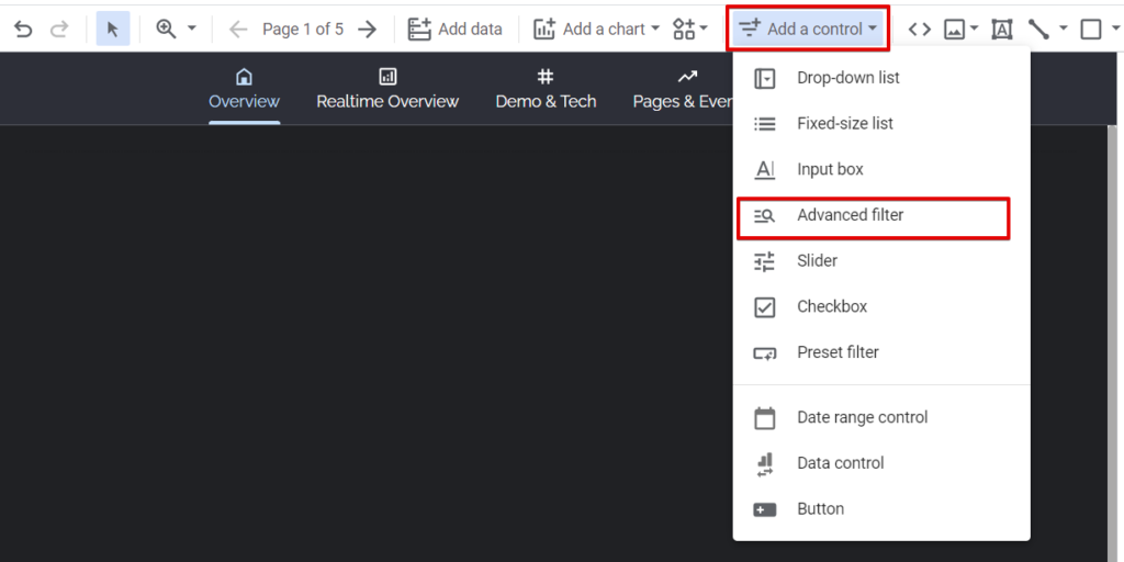
Click the “Add a control” menu option and select “Drop-down list”.
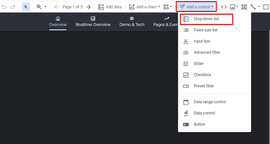
Add the filter, customize it and duplicate it for the other filter dimensions.
If you like the Hour advance filter option, as shown in the image below, you’ll have to use the “Advance filter” option and have the hour difference calculated fields we created earlier.
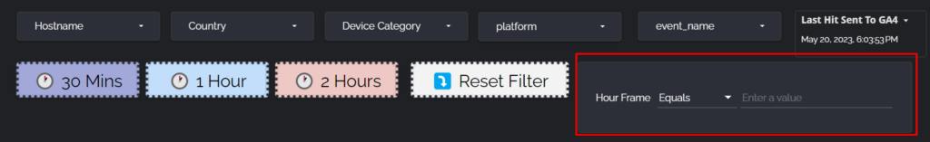
As we did with the “Drop-down list” filter type, you must select “Advance filter” instead.
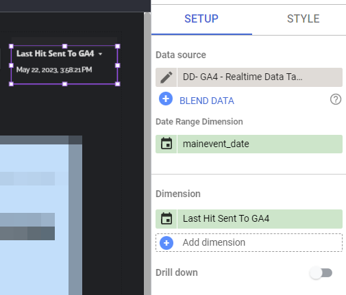
You can also customise a table chart to show only the timestamp for the last data exported from Google Analytics 4 (GA4) to BigQuery.

Use the date-time dimension as the only table dimension, don’t add metrics, and hide the table row numbers.
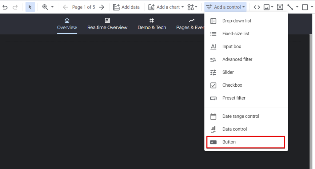
While for the buttons, it’s optional as the *Hour control filter should help with the same thing. However, if you still need to make the dashboard intuitive for the users, you can add the four buttons described below;
Start by adding a button by clicking the “Add control” in the navigation menu and then select “Button”.
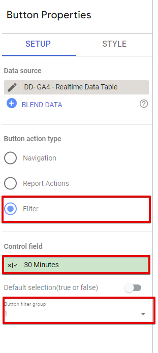
Button 1 – 30 Mins Button:
Button Text: Yours to decide
Button Action Type: Filter
Button Filter Group: 1
Control Field Formula:
IF(DataRealtimeHour = 0 AND date_time_minute <= 30, TRUE, FALSE)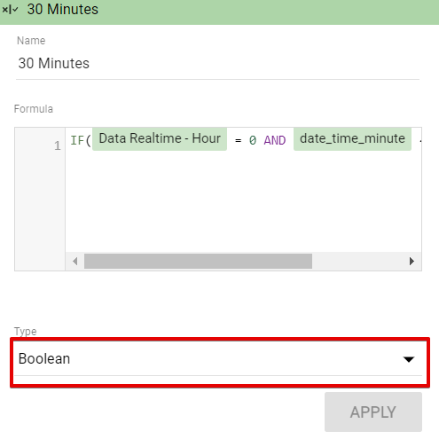
Here is what the button setup configuration should be.
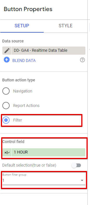
Button 2 – 1 Hour Button:
Button Text: Yours to decide
Button Action Type: Filter
Button Filter Group: 1
Control Field Formula:
IF(DataRealtimeHour = 1, TRUE, FALSE)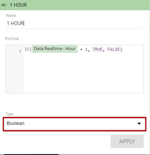
Your button’s final configuration should be as displayed in the image below.
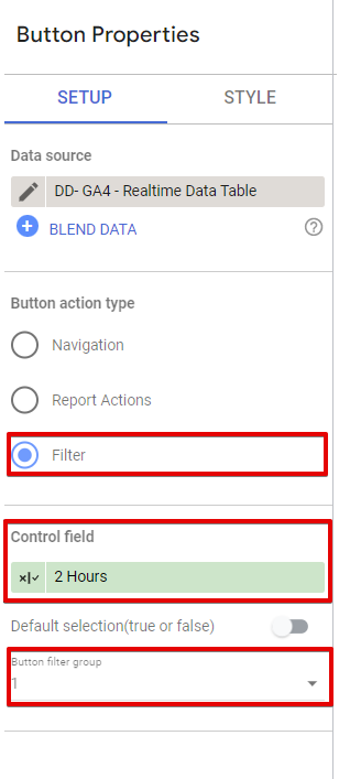
Button 3 – 2 Hour Button:
Button Text: Yours to decide
Button Action Type: Filter
Button Filter Group: 1
Control Field Formula:
IF(DataRealtimeHour <= 2, TRUE, FALSE)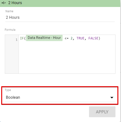
Your button configuration setup should be as shown in the image below.
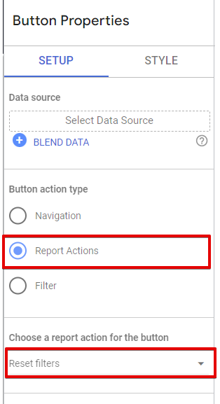
Button 4 – Reset Button:
Button Text: Yours to decide
Button Action Type: Report Actions
Action Type: Reset Filter
Adding Charts Components To The Report
Exciting news! Now it’s time to incorporate charts into our report, enabling our dashboard users to effortlessly gain valuable insights and make informed decisions based on the real-time data gathered in Google Analytics (GA4).
To streamline the process, I will skip the construction of the dashboard overview, as it may not align with your specific requirements. Instead, we’ll begin from the “Realtime Overview” page and proceed to the “Debug View” section. So, without further ado, let’s dive right into adding the charts.
I want to mention that the dashboard presented in this example does not adhere to certain best practices in dashboard design, such as providing descriptive information about the purpose of each chart or group of charts. I intentionally overlooked this guideline because the dashboard is used exclusively by the DumbData community.
However, I recommend ensuring that your Looker Studio users can easily understand the insights they will gain from each section or chart of the report.
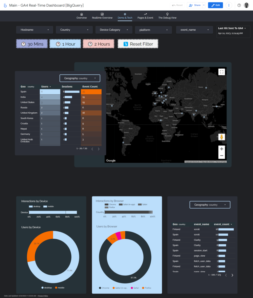
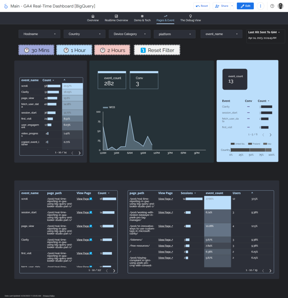
The Realtime Overview Page:
On this page, we added the following chart types;
- Scorecard (users, sessions, new users, interactions which is event count)
- Table (page path and page views)
- Pie charts
- Stacked Area Chart (users by hour broken down by platform)
- 100% Stacked Bar Chart (used to breakdown some of our metrics by different dimensions)
In this section which shows the last 30 minutes’ data, we’ll apply the filter below.
To create a 100% stacked bar in the format below, follow these steps: Choose the dimension you want to break down by and the metric you prefer. Use only a label text in the field dimension, as the screenshot below illustrates.
This section of the report shows the last 30 minutes of data collected in GA4.
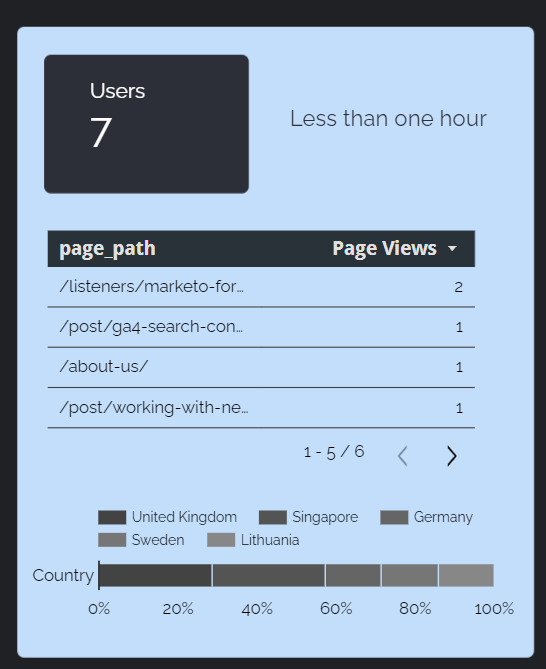
Here is the filter configuration applied to the charts in that section (it shows data collected in the last 30 minutes)
This video should explain the visualization.
The Demo & Tech Page:
The charts used in this section are as follows:
- Bubble map (I applied a chart-level geography dimension selector to make the map dynamic, which I created using a parameter and a calculated field).
- 100% Stacked Bar Chart
- Table
- Pie Charts
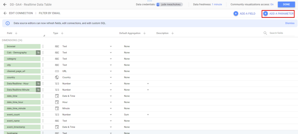
I navigated to the “BQ real-time data table” data source level to add a parameter and clicked the “Add Parameter” button. I specified the data type as text and named it “Geography”. However, you can choose any name you prefer, remembering it is displayed in the report UI when applied to the report’s control filter.
You can click the “Add a parameter” option under your BigQuery GA4 real-time data table.
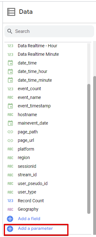
Alternatively, you can navigate to the data source configuration and click the “Add a Parameter” option.
For this parameter, I set the permitted values as a “List of Values” and added the following options to the list:
- Country
- Region (represents state)
- City
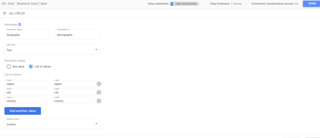
Include the corresponding labels for each value, and then click the save button to finalize the parameter setup.
Next, you’ll have to create a calculated field that enables the dimension type to be dynamic depending on the selected control field. Here is an example of the calculated field, which automatically assumes either Country, Region, or City as the dimension based on the parameter value.
CASE Geography
WHEN "country" THEN country
WHEN "region" THEN region
WHEN "city" THEN city
END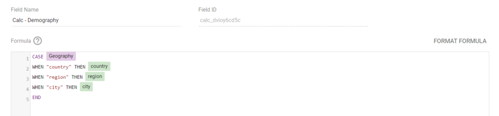
Subsequently, we will apply the parameter as a control field and utilize the newly created dynamic geographic dimension calculated field as the dimension for both the map and table.
This video should explain the visualization aspect.
Pages & Events:
This page in the report has the following charts;
- Table
- Scorecard
- 100% Stacked Bar Chart
- Stacked Area Chart (event interactions by hour broken down by platform)
This short video should explain the visualization part.
The Debug View Page:
In this section of the report, our objective was to replicate a functionality akin to the Google Analytics 4 debug view. However, our primary emphasis was promptly identifying the event parameters dispatched alongside a GA4 event and their respective data types.
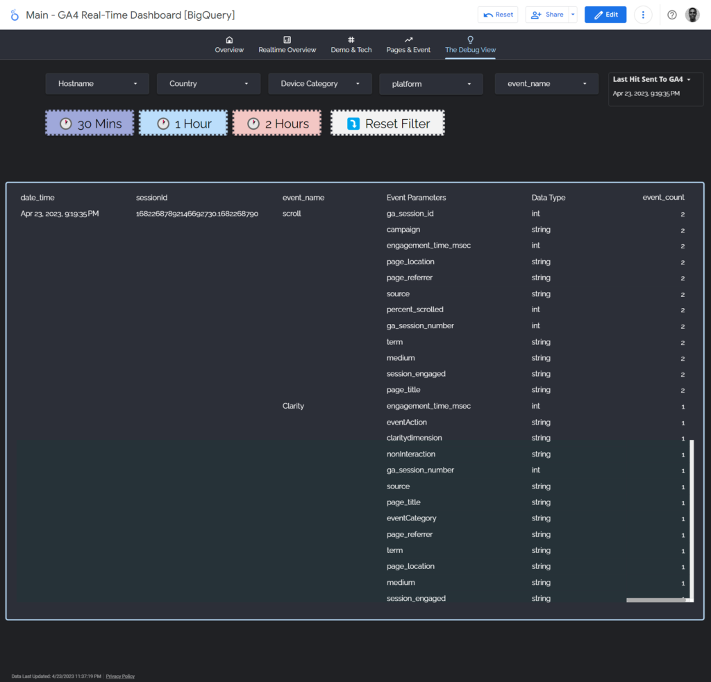
While it is possible to delve deeper and display the values as well, accomplishing this entails additional effort, which will not be covered in this tutorial.
How did we create this?
By blending our “GA4 Realtime Data Table” and “GA4 Realtime Event Parameter Table” using the “sessionId” as the join key, here is what our blend configuration looks like.
We utilize this blended data source in a pivot table chart type, incorporating the following dimensions and one metric for data visualization:
- date time
- sessionId
- event_name
- data type
- event count
We sorted the pivot table by the “date-time dimension” to display the latest event hit as it’s collected.
We intend to share a sandbox template that will get you started with your real-time GA4 Looker Studio dashboard. To get notified when it’s ready, subscribe to our newsletter.
Conclusion Part
We have concluded this blog post, where we delved into the process of building a dashboard for Google Analytics 4 real-time reporting using BigQuery and Looker Studio.
Throughout this article, we have explored the report’s structure, the utilization of calculated fields, and the various transformations and blending techniques applied to achieve the desired outcome.
It’s crucial to customize your reports to meet the unique requirements of your business or clients.
If you found this article engaging and would like to stay informed about future publications on Google Analytics 4 from DumbData, we invite you to subscribe to our newsletter. By doing so, you will receive updates on our latest innovations in the analytics field.
Content Contributors

Jude Nwachukwu Onyejekwe;
Loves watching magic videos, and documentaries, writing about measurement and helping non-technical marketers succeed. Jude is a marketing analytics specialist with Hedy and Hopp (a Healthcare marketing agency based in St Louis, US) and DumbData’s co-founder.

Jonah Tochukwu Onyejekwe;
Jonah loves tourism, documentaries, history, marketing and data. Jonah is an analytics specialist with Elevar, your Shopify store’s most important arsenal for growth.