


Time significantly influences many aspects of life, and data can help provide valuable insights into how time influences human digital behaviour and affects marketing and business performance. Using the data in your Google Analytics (GA4) property, you can understand how time and date-related data points, such as the day of the week and the hour of the day, impact various metrics critical to your business health. These insights can guide you in leveraging time in your marketing strategy.
The approach discussed here can also help you understand how other related dimensions interact with these time and date variables. This understanding lets you decode the temporal nuances embedded in your data, uncover opportune moments to reach your target audience, adjust marketing spend, reinforce your strategy, and identify patterns and trends that may profoundly impact your business.
In this article, you’ll gain access to a Looker Studio dashboard that simplifies the study of trends and patterns in your Google Analytics (GA4) data, particularly how time dimensions such as “hour of the day” and “day of the week” impact your business and marketing performance. You will access the dashboard and learn how to create one for your business and understand how to use and interpret its data.
The Looker Studio dashboard template helps answer time-related marketing and business questions, such as:
- What time/hour of the day or day of the week should you increase or decrease your ad budget, show your campaign to customers, or offer a discount banner on the website?
- What does performance look like across key metrics such as acquisition, engagement, activation, conversion, and revenue during different hours of the day, days of the week, and types of weeks (weekend or weekday)?
- What trends and patterns exist regarding how time and day influence communication that you can learn from for your business?
The insights from the dashboard can be particularly helpful for ad scheduling in Google Ads, determining the best days and hours to display your campaign or adjust bids.
Please note that ad scheduling is incompatible with Smart Shopping and App campaigns in Google Ads.
Before we go into the details of this guide on using Looker Studio to build the Google Analytics (GA4) hour of the day, day of the week report, which provides insights on how the time of day and day of the week influence acquisition, engagement, revenue, and conversion metrics and allows for comparisons between metrics on different days or hours, let me show you a demo video of the finished Looker Studio dashboard we released for the Public.
You can access the report here.
Creating the Google Analytics (GA4) Hourly & Day of the Week Performance Report in Looker Studio
To create this report, ensure that you have connected your Google Analytics (GA4) property to Looker Studio as a data source and created a new report for this analysis.
For this dashboard build, we will need:
- A Metric Control
- Report Controls (including dimension control)
- Dashboarding Charts such as pivot tables, time series charts, and some report pages.
Please note that the data displayed uses the time zone configured in your Google Analytics (GA4) property. This is important to consider when you operate an international business and a website with visitors from different time zones.
However, if you use BigQuery, you can display the data in your preferred time zone, which is different from the GA4 property configuration. I discuss this in my guide to building a Google Analytics real-time dashboard using BigQuery and Looker Studio.
Let’s create the necessary components for this dashboard.
Report Configuration & Page Structure:
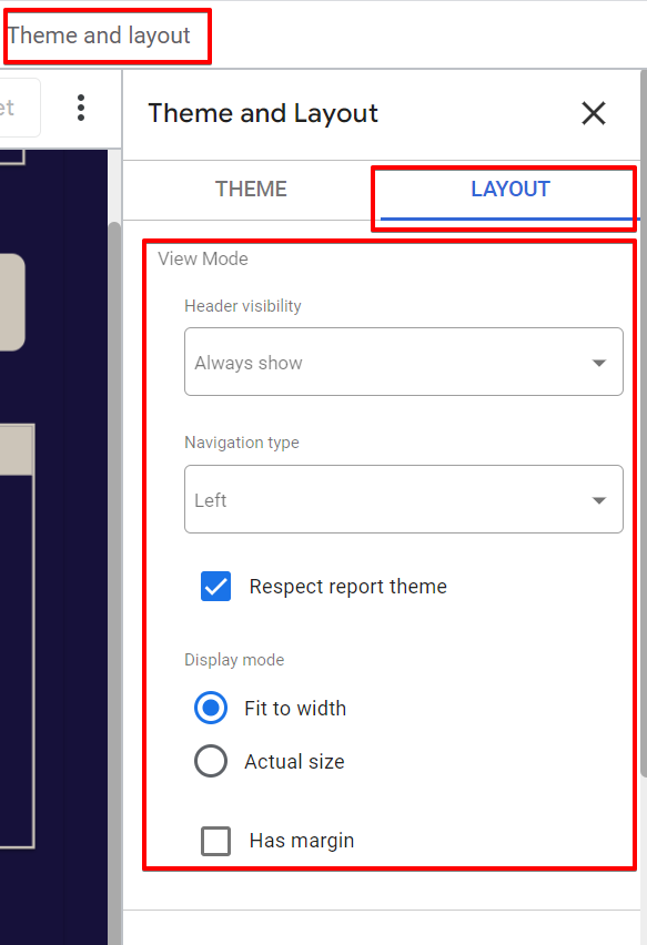
First, customize your report’s branding, layout, and theme. I won’t detail my settings here, but choose what works best for you.
Regarding the report navigation type, I recommend keeping it as “Left,” but you can choose your preference.
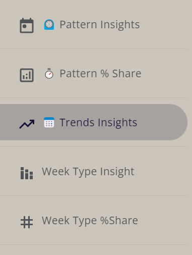
This report will have five main pages:
- Pattern Insights
- Pattern % Share
- Trend Insight
- Week Type Insight
- Week Type % Share
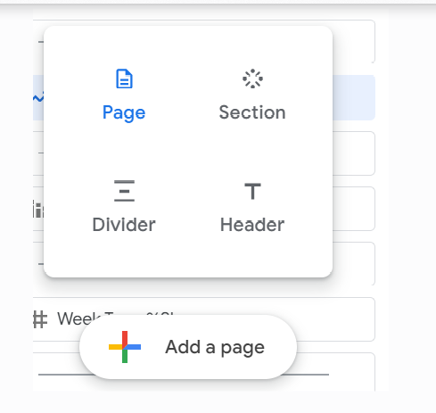
You can always add more pages by clicking the “Create new page” option.
The data and date range controls, which we’ll make report-level, will be one consistent visible element across all report pages.
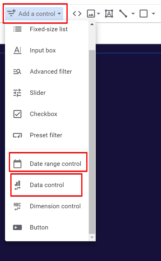
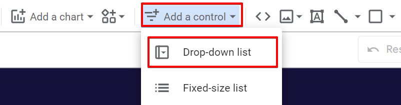
To add the data control, click the “Add a control” option at the top of the menu and add both the “data control” and “date range control” types.
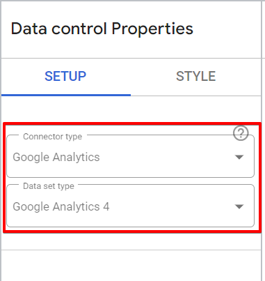
In the “data control” configuration, choose “Google Analytics” as the connector type and “Google Analytics 4” as the data set type.
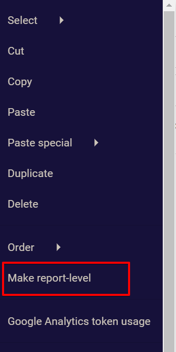
After adding and styling both controls, select them and make them report-level by right-clicking and selecting the “Make report-level” option.
You can ignore the social share button element, but if you want to learn how to add a social share button in Looker Studio, please check out this article that covers it in detail.
Building the Pattern Insights and % Share Pages of the Report:
Let’s explore the first two pages of the report, focusing on the insights they provide and the visualization elements they contain. We’ll begin by adding the metric control used across various pages in the Looker Studio dashboard.
Creating Metric Controls, Charts, and Report Controls:
We’ll start with the metric control. This blog post provides a detailed step-by-step guide on building a metric control in Looker Studio. However, I will still cover the general process here.
The metric control allows report users to switch between different metrics and observe how time influences data distribution in Google Analytics.
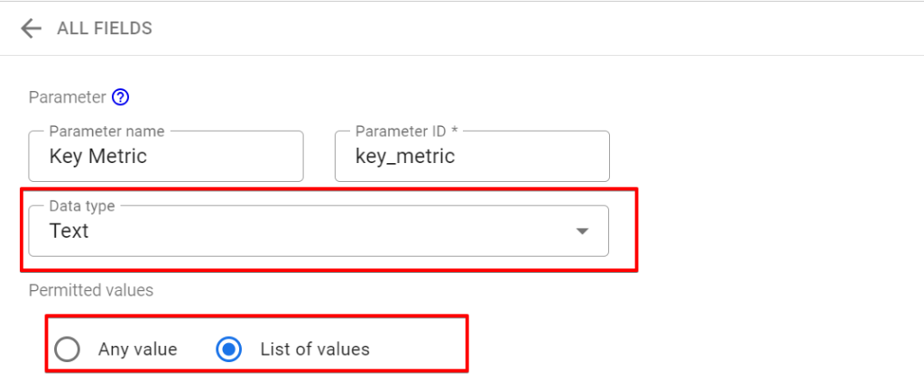
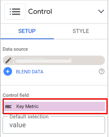
1. Create a New Parameter:
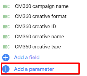
Click the “Add a parameter” option in the GA4 data source.
Name it and select “Text” as the data type. If necessary, you can also edit the parameter ID.
Under “Permitted values,” select the “List Values” radio button.
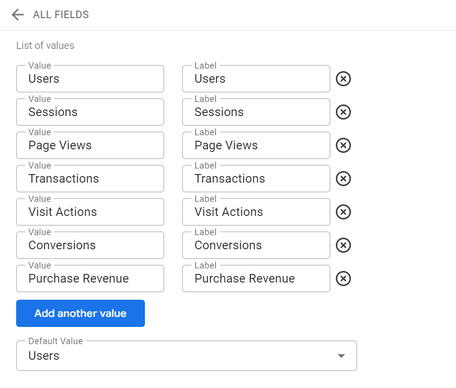
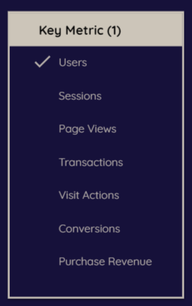
2. Add Values to the Parameter:
Add the following values, keeping the labels the same:
- Users
- Sessions
- Page Views
- Transactions
- Visit Actions (used to represent event counts, which can be useful for analysis drilled down to a specific event)
- Conversions (Key Events)
- Purchase Revenue
Set “Users” as the default value, then save the parameter.
3. Create a Dynamic Metric:
Create a dynamic metric with “Calculated Fields using the parameter values.” start by Clicking the “Add a field” option, name the calculated field, and use the following CASE statement code to map the parameter values to the metrics in the GA4 data source.
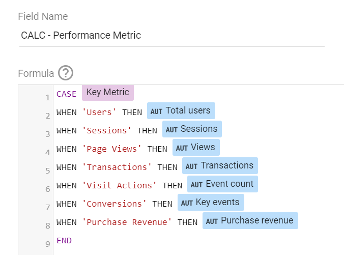
CASE Key Metric
WHEN 'Users' THEN Total users
WHEN 'Sessions' THEN Sessions
WHEN 'Page Views' THEN Views
WHEN 'Transactions' THEN Transactions
WHEN 'Visit Actions' THEN Event count
WHEN 'Conversions' THEN Key events
WHEN 'Purchase Revenue' THEN Purchase revenue
END
And then save the newly created field.
4. Add the Metric Control:
Click the “Add a control” menu option and select the “Fixed size list” control type.
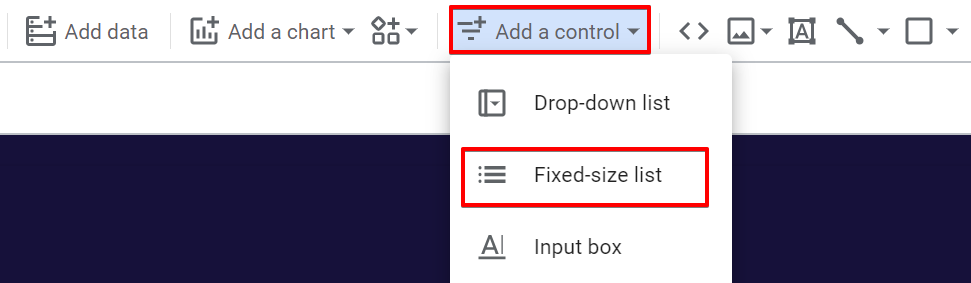
Add the parameter created earlier to the control.
These steps will enable users to switch between different metrics and observe how time influences data distribution in Google Analytics.
By following this process, you’ll create the foundational elements needed for the Pattern Insights and % Share pages, helping you visualize and analyze the impact of time on your data effectively.
Adding Charts to the Report:
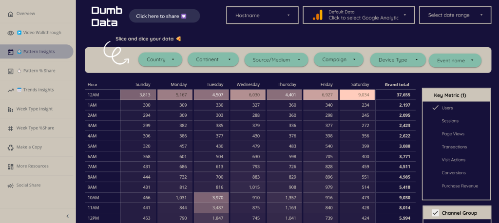
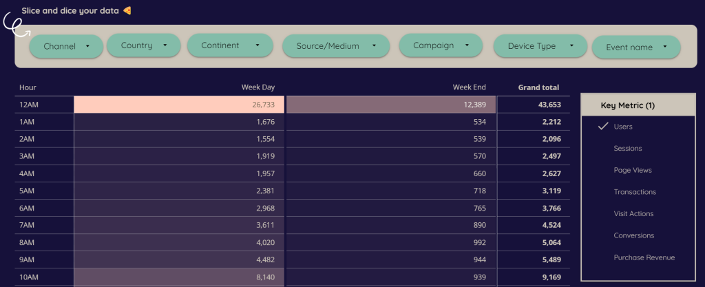
Now that you’ve successfully created the metric control, it’s time to add a “Pivot table” chart type with a heatmap.
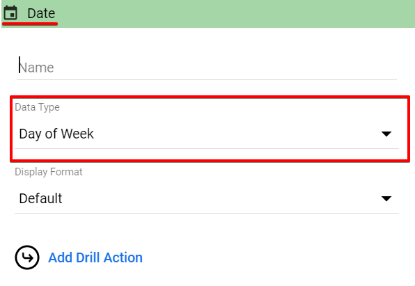
First, you’ll have to add the “Pivot Table Chart,” then Add the “Hour” dimension as a row, and then add the “Date” dimension as the column dimension.
However, in the “Data Type” settings, select “Day of the week.”
The next step involves adding the “Dynamic Key Metric”, which allows you to use the dynamic metric we created as a calculated field.
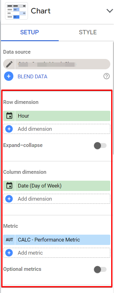
The calculated metric will allow you to switch between different metrics to see the distribution pattern across the time of day and day of the week.
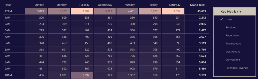
If the numerical values alone don’t provide clear insights, the heatmap will help you identify which values to focus on.
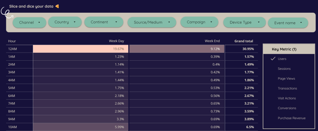
Another thing you should do on a separate page is the ability to view the percentage share of each cell in the total number of purchases, conversions, users, etc., for each hour of the day and day of the week cell.
After you’ve added the “Dynamic Metric”, you’ll have to change the dynamic metric data type to “per cent” and ensure the comparison calculation gets set to “Percent of the total.”
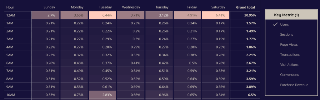
With this setup, you can identify the most valuable hours and days. For example, 1.16% of total sales occur at noon on Wednesdays, or 30% of all purchases or website visits happen at 2 PM during the week.
If you notice traffic and conversion dips during weekends, focus on understanding which weekdays drive the most results.
We’ll add some controls to the Looker Studio dashboard to make it easier for users to slice the report. The next section will discuss this.
Adding Controls to the Looker Studio Report:
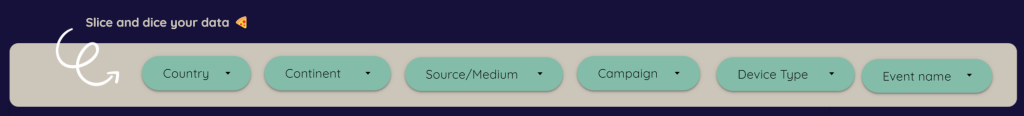
The next step is to add report controls to make it easier for you and your team to slice the data in the Looker Studio dashboard.
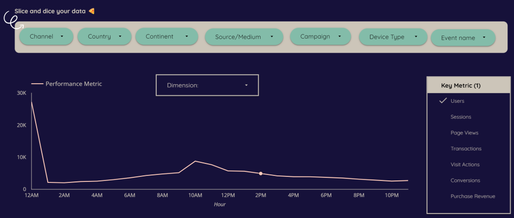
Click to add the “drop-down list” type of control to Looker Studio. Each control should use the following dimensions:
- Country
- Continent
- Source/Medium (session-based)
- Campaign
- Device Type
- Event Name

These controls, or data filters, will help segment and filter your data when analyzing it for insights. For example, in last month’s data, you might notice a spike in activity from Monday to Wednesday. Without proper filters, you might attribute this spike to those days being inherently more effective, missing other potential factors like increased paid campaign budgets or a political event that boosted traffic. Data slicers are essential for gaining a more nuanced understanding.
Building the Trends Insight Page:
In this section of the report, we’ll use a time series chart to understand data trends and how they are impacted by time-related dimensions such as the hour of the day and the day of the week in your Google Analytics data.
This part of the report will consist of a single page, which can be used for:
- Comparing the trend of a single metric across days of the week and times of the day.
- Comparing the trends of two different metrics across days of the week.
- Comparing the trends of two different metrics across times of the day.
To build this page visualization:
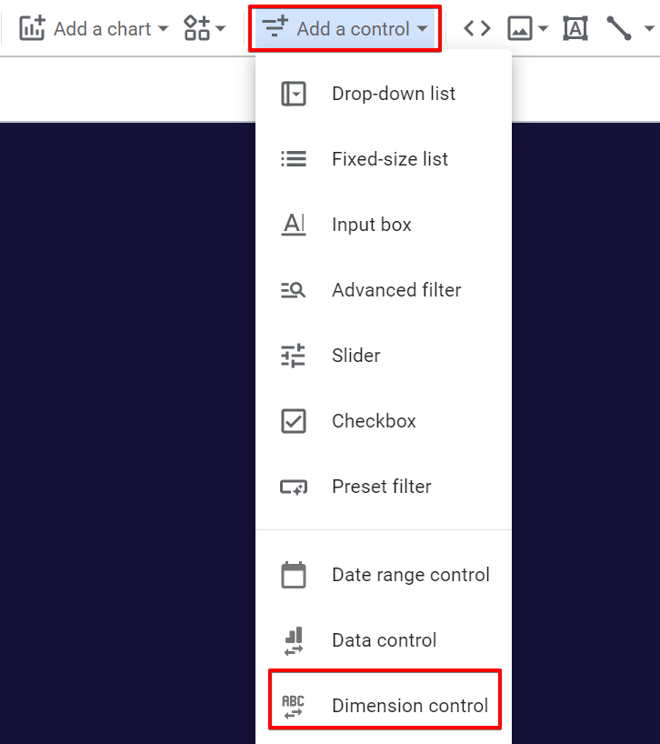
Start by adding the metric control we created earlier, a dimension control allowing viewers to switch between “day of the week” and “hour of the day” dimensions.
In the next step, click the control and select the “dimension control” type.
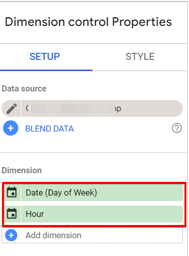
In the “Dimension Control” properties, ensure you add both the “Hour” and “Date” dimensions. For the “Date” dimension, select the “Day of the week” in the settings option.
Your next step is to add two line chart elements by creating one, duplicating the previous chart, and inserting a line chart between both charts.
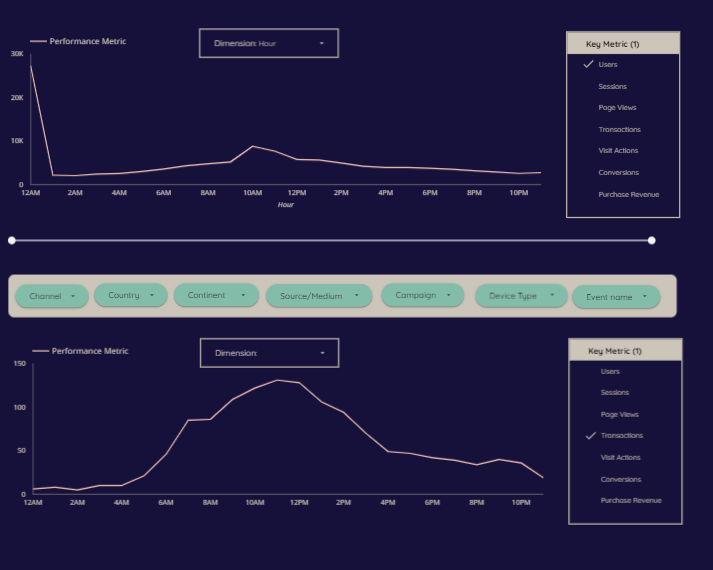
After properly arranging and structuring the report elements, you should group each chart with its controls so that the dimension and metric control can change the data for each chart.
With this setup, the report viewer can compare two metrics across the same time-related dimension or a single metric across different time-related dimensions.
Week Type Analysis:
Like the “Pattern Insights” and “Pattern % Share” sections, you’ll follow the steps outlined earlier in this guide. However, instead of using the “Date” dimension converted to “Day of the Week,” you’ll create a calculated dimension.
To categorize the days of the week as “Weekend” or “Weekday,” use the following CASE statement:
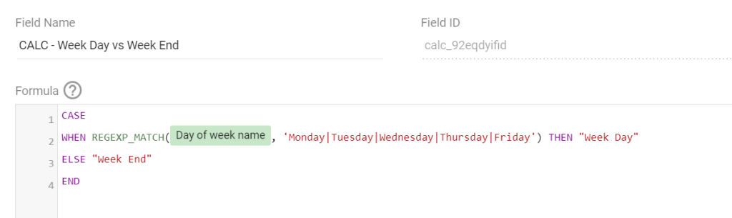
CASE
WHEN REGEXP_MATCH(Day of week name, 'Monday|Tuesday|Wednesday|Thursday|Friday') THEN "Week Day"
ELSE "Week End"
END
The outcome should resemble the previous sections, as shown below, and you can apply your preferred design changes.
For the % share, use the same approach as “Pattern % Share.”
Closing Remarks:
When analyzing data with the Looker Studio dashboard template, use a more extended date range to better identify trends and patterns of how time and date-related dimensions influence business performance.
For businesses that typically see lower performance during weekends, remember that this doesn’t mean weekends are worthless. It just means your audience is more active during weekdays.
Also, remember that the report uses the time zone configured in your Google Analytics (GA4) property. Be mindful of potential insight traps if your audience spans different time zones.
Here is a quick summary of what I’ve covered in this blog post.
To summarize what has been covered so far, I started by highlighting the significance of time and date variables in marketing and business performance in this guide. I also shared a dashboard sample and provided information on how to access the public template we’ve built at DumbData.
While I didn’t cover every step in detail, I provided the knowledge needed to build critical components of the dashboard and interpret its data. This guide helps you use your Google Analytics data to understand business performance by time-related dimensions such as “hour of the day” and “day of the week,” identifying useful patterns and trends to inform your marketing strategy and optimize performance.
If you have any feedback or questions about this article, feel free to reach out to me via the DumbData team email or LinkedIn. Until the next post, happy measuring.