

If you’re working on a Looker Studio project and want to use a metric control for your charts, similar to the dimension control feature, this short article will guide you through setting up metric control in Looker Studio.
Please note that as of the time of writing, Google has not released a native metric control feature like the dimension control in Looker Studio. Therefore, we’ll be manually creating this feature in Looker Studio.
The process is not complicated, and I will demonstrate it in this blog. But first, let’s explore how metric controls can be highly beneficial.
Just like the dimension control in Looker Studio, the metric control allows report viewers to change the metric on one or more charts without needing to edit the report. Using a metric control eliminates the need to create separate charts and reports to show related data and varying levels of granularity.
One use case I’ve found valuable is using analytics data to understand how time (day and hour) impacts different business metrics across acquisition, activation, revenue, engagement, and retention.
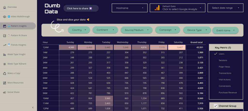
The DumbData measurement resource hub has a public Looker Studio dashboard template for this use case, which you can see here. You can also make a copy yourself.
I used the metric control to reduce the number of charts and quickly compare the impact between two metrics, and I demonstrated this using Google Analytics (GA4) data. You can find the article about that use case here.
It can also help you avoid redundancy in your charts that use the same dimension but different metrics. For example, instead of having multiple bar charts showing data of device category by revenue, sessions, users, transactions, conversions, etc., you can create just one chart and switch between metrics using the metric control.
Let’s go through the creation process after you’ve seen how useful this control can be in your Looker Studio project. We’ll start by highlighting the steps to follow:
- Creating the parameter that houses the value representing a metric.
- Creating a dynamic metric using a CASE statement to make this possible.
- Creating the chart where we’ll apply the dimension and the dynamic metric.
- Adding a control that acts as the metric control.
Now that you have an idea of the creation process let’s walk through the build step and see what the outcome looks like.
As a bonus, I’ll also show you a cool way to blend it with dimension control.
Step 1: Create a Parameter
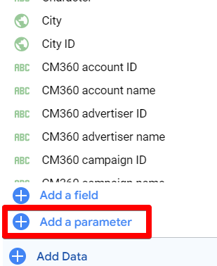
In your Looker Studio report, click the “Add a parameter” button in the data source. You will be using this parameter for your metric switcher.
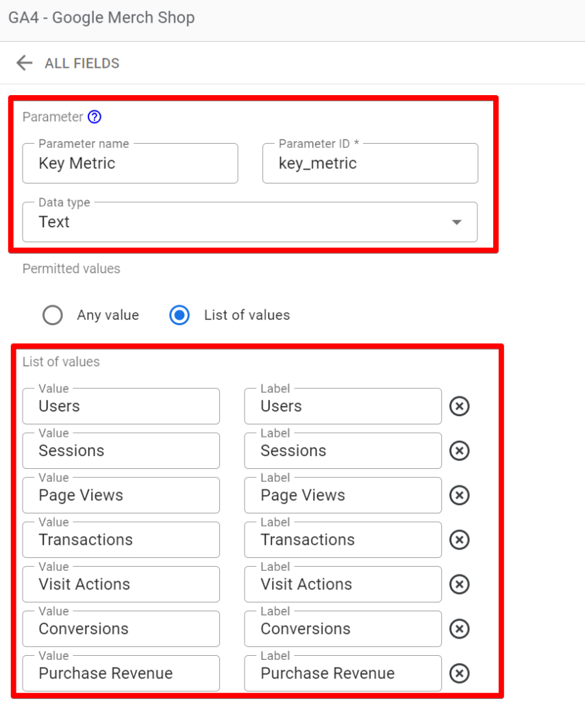
In the parameter builder view, give the parameter a name and customize the parameter ID if necessary.
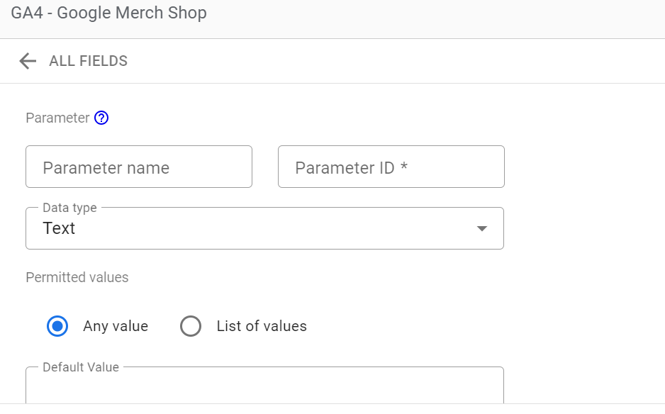
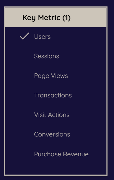
Select “Text” as the data type and choose the “List Values” option under the “Permitted Values” settings.
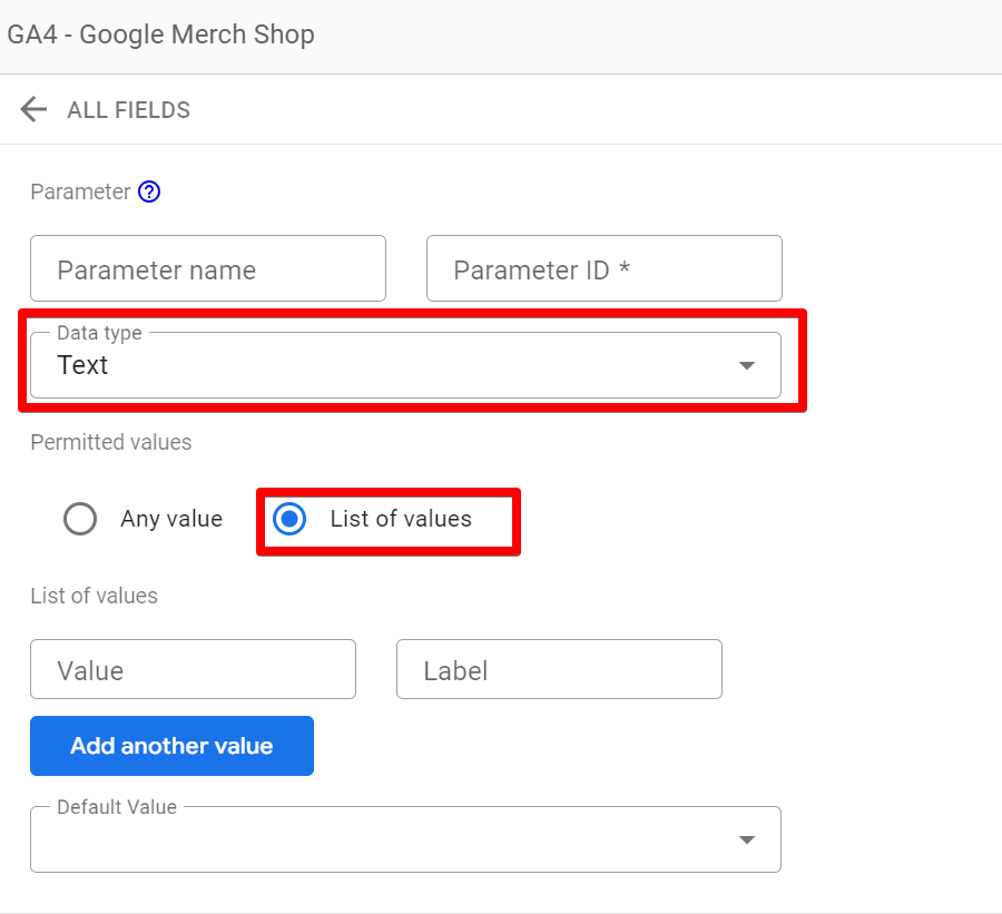
Now, add your values. For my example, I added the following values and kept the labels the same:
- Users
- Sessions
- Page Views
- Transactions
- Website Interactions
- Conversions
- Purchase Revenue
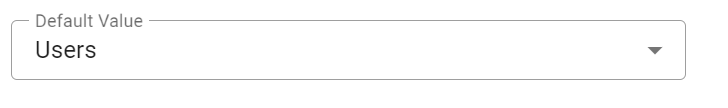
Set the default value to “Users,” then save the parameter. Now, let’s proceed to the second step.
Step 2: Creating the Dynamic Metric
In this step, we’ll use a CASE statement to ensure that the metric is dynamic when the control is used to switch the metric in the chart.
The CASE statement will reference the value of the parameter we created in Step 1 and map it to the actual metrics in our data source.
To do this, we’ll use “Calculated Fields.” These fields can be created at different levels, such as the chart or data source level, but for the purpose of this blog post, we’ll create them at the data source level by clicking the “Add a field” option.
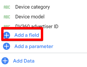
Give the field a name, enter the CASE statement formula below, and save the field.
Note: If you changed the name during the parameter creation process, ensure the change is reflected in the formula above.
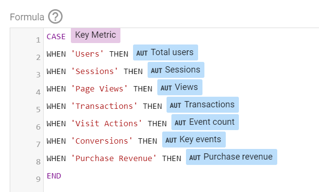
CASE Key Metric
WHEN 'Users' THEN Total users
WHEN 'Sessions' THEN Sessions
WHEN 'Page Views' THEN Views
WHEN 'Transactions' THEN Transactions
WHEN 'Visit Actions' THEN Event count
WHEN 'Conversions' THEN Key events
WHEN 'Purchase Revenue' THEN Purchase revenue
END
After this step, you can start using the dynamic metric field in your chart. However, you’ll need to use a control button to allow the report viewer to easily switch the metric they want to use to view their data.
Steps 3 & 4: Applying the Dynamic Metrics to the Chart and Adding the Control Field
I’ll combine steps three and four for this section to achieve our goal.
First, select the chart with which you want to use the metric. In my case, I created a new chart and added a dimension and the dynamic metric field as metrics in the chart.
Next, add the metric control to facilitate easy switching. Click the “Add a control” menu option, select the “Fixed size list” option, and add the initial parameter we created in Step 1.
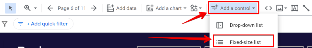
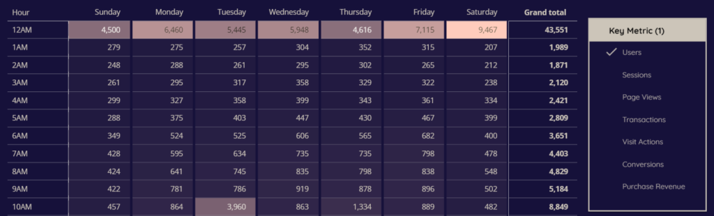
Now, you should be able to switch between different metrics directly from the same chart.
Additional Insight (Including Dimension Control In Looker Studio)
You can also add a dimension control element, making using the same chart with different dimensions and metrics easy.
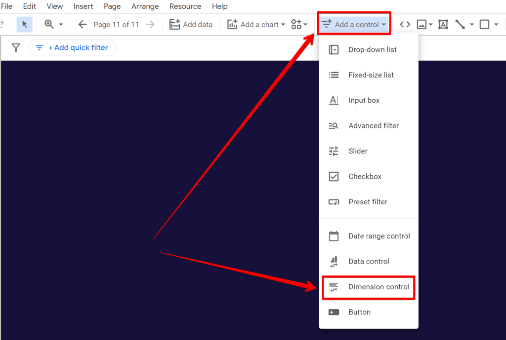
Click the “Add a control” option in the top menu, select the “Dimension Control” type, and add the dimension you want to allow the dashboard viewer to swap between.
After adding the dimension, you’ll be able to switch dimensions and metrics within the same charts without creating multiple charts.
Here are a few things to keep in mind when using the dimension control:
- By default, a dimension control affects all charts on the current page of the report that use the control’s data source.
- To limit the scope of the dimension control, group the dimension control with one or more charts.
- Ungrouped dimension controls will ignore any charts that are grouped with a different dimension control.
Closing Thoughts
In this Looker Studio tutorial, we explored metric controls, how to create one, and some of their use cases, we also covered using the Looker Studio dimension control in the same chart as the metric control.
One downside to the dashboard experience with the metric control is that the metric you switch to won’t get displayed as the metric label. You can only determine the active metric by looking at the selected metric. However, this doesn’t significantly detract from its usability if there is a genuine need for it in your Looker Studio dashboard.
To understand our use of metric control, explore the FREE public Google Analytics [GA4] reporting template for hour of the day, day of the week, and week type (weekday and weekend). Additionally, I’d like to introduce you to the FREE Google Analytics [GA4] Audit Tool and UTM Audit Tool available in the DumbData Measurement Resource Hub.
I’ll close this blog post by asking if there was anything new you learned, if you feel I missed anything, or if you want to share feedback. You can reach out via the information or form on the DumbData Contact Us page or LinkedIn. Until then, happy measuring!